Form fields
Form fields are created using the accept-input function:
(accept-input INPUT-TYPE QUERY-NAME &REST ARGS &KEY STREAM &ALLOW-OTHER-KEYS)
The returns are accepted by the response function to an exported URL. See EXPORT-URL and the macro BIND-QUERY-VALUES used within response functions.
Required arguments
input-type - the symbol denoting an defined input type. The following types are provided:
- string
- password
- multi-line-text
- checkbox
- radio-button
- select-choices
- client-side-button
- file
- hidden
- image
- submit-button
- reset-button
QUERY-NAME -- a unique name for the value returned by form submission.
Keyword arguments:
default - the default value to use in lieu of user input (available for most input types).
disabled - disables the form control for user input (boolean).
read-only - prohibits changes to the form control (boolean).
label - provides the label for a form control. This can be a string for all input types, except CHECKBOX and RADIO-BUTTON. For FILE, IMAGE, MULTI-LINE-TEXT, PASSWORD, SELECT-CHOICES and STRING, it can be a destructed argument list of the form: (LABEL-SPEC POSITION &KEY ACCESS-KEY ID CLASS LANGUAGE DIRECTION TITLE STYLE EVENTS), where POSITION can be either :BEFORE or :AFTER.
class - the class for the element (string, function). ID -- an element identifier (string, function).
style - specifies inline parameters to use in the default style sheet language (string, function). TAB-
index - an integer denoting position in the tabbing order.
access-key - a single accessibility character from ISO 10646.
title - a string used as an element title (string, function).
language - the two-digit language code for the displayed content (see RFC 1766) (string, function).
direction - the base directionality of neutral text and can be either :LEFT-TO-RIGHT or :RIGHT-TO-LEFT.
events - If a browser supports client-side events on form input types, they can be passed in via this argument. EVENTS can be any of the intrinsic events: :INPUT-DEFOCUS, :INPUT-FOCUS, :KEY-DOWN, :KEY-PRESS, :KEY-UP, :MOUSE-CLICK, :MOUSE-DOUBLE-CLICK, :MOUSE-DOWN, :MOUSE-MOVE, :MOUSE-OUT, :MOUSE-OVER, :MOUSE-UP, :NEW-VALUE, :SELECT. Use the macro WITH-EVENT-HANDLERS to establish the binding for input events. Note that form submission events are supplied via the macro WITH-FILLOUT-FORM.
preamble - A function or string that is written before the input-type. If PREAMBLE is a function, it is called with (INPUT-TYPE STREAM ARGS) A typical use is to emit a JavaScript invoked by an input type.
stream - the stream on which to write raw HTML generated by the input-type. Additional Arguments on a per input-type basis. Input Type Keyword Arguments
String
Allow the user to type in a string on a single line. For example:
(accept-input 'string "date" :label "Enter the date:" :default "DD/MM/YY"
:size 36 :stream stream)

Optional keyword arguments
default should be a string or null.
size is an integer, default 72, specifying the size to make the visible input field.
max-length is an integer, default 240, specifying the maximum size which the input field may reach but not top exceed 1024 characters.
[Additional] LABEL, PREAMBLE, DISABLED, READ-ONLY, ID, CLASS, LANGUAGE, DIRECTION, TITLE, STYLE, EVENTS, TAB-INDEX, ACCESS-KEY.
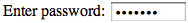
Password
Just like the string input type except the client does not display the input. For example:
(accept-input 'password "pwd" :label "Enter password:" :default "Default"
  :title "Title" :stream stream )
size [Optional] is an integer, default 10, specifying the size to make the visible input field.
[Additional] LABEL, PREAMBLE, DISABLED, READ-ONLY, ID, CLASS, LANGUAGE, DIRECTION, TITLE, STYLE, EVENTS, TAB-INDEX, ACCESS-KEY.
Multi-line text
Allows the user to type in or edit multi line text in a scrollable input box.
Optional keyword arguments
default should be a string, null, or a function which is called on STREAM.
columns is an integer, default 72, specifying the width of the visible input field.
rows is an integer, default 5, specifying the height of the visible input field.
[Additional] LABEL, PREAMBLE, DISABLED, READ-ONLY, ID, CLASS, LANGUAGE, DIRECTION, TITLE, STYLE, EVENTS, TAB-INDEX, ACCESS-KEY.
Checkbox and radio-button
The checkbox allows the user to select a sequence of values by checking boxes. The radio-buttonallows the user to select a single value by selecting a button. Otherwise they are identical. For example:
(accept-input 'checkbox "Q2" :choices '("One" "Two" "Three" "Four") :stream stream )

This second example shows the :layout :none option:
(accept-input 'radio-button "Q1" :layout :none
  :choices '("One" "Two" "Three" "Four") :stream stream )

choices is a list of choice values, a compact dotted alist (<Choice-string> . <choice-value>), or an alist of (<choice-string> :VALUE <choice>). Each choice displayed according to its position in the list.
Extended arguments to for the choice use the destructuring argument list format: <choice-spec> :: (CHOICE-STRING &key VALUE DISABLED ID CLASS LANGUAGE DIRECTION TITLE STYLE EVENTS TAB-INDEX ACCESS-KEY). Extended arguments apply to the individual choice. The three choice formats may be intermixed.
When the extended format does not supply a more specific value, choices default their extended parameters to following arguments for the toplevel input-type: DISABLED, CLASS, LANGUAGE, DIRECTION, CHOICE-STYLE, CHOICE-EVENTS.
When ID is supplied to the top level input type, indivial choice IDs are automatically defaulted to "<id><choice-position>", where <choice-position> is an integer with zero origin corresponding to the position of the choice.
Optional keyword arguments
default is a single value which is the default. It is compared to the values in CHOICES with EQUAL.
layout controls the layout of buttons and can be any of: :ENUMERATION, :DIVISION, :INLINE, or :NONE.
:enumeration is any valid argument to WITH-ENUMERATION and only takes effect when LAYOUT is :ENUMERATION.
item-style is a style argument to ENUMERATING-ITEM.
item-events is an events argument to ENUMERATING-ITEM.
[Additional] PREAMBLE, DISABLED, ID, CLASS, LANGUAGE, DIRECTION, TITLE, STYLE, EVENTS supply parameters to toplevel element for enumeration or division, as well as enumeration items (except ID, PREAMBLE).
Select-choices
Allows the user to select either a single or multiple choices.
[Required] CHOICES is a list of choice values or an alist of (<choice-string> :VALUE <choice>). Each choice displayed according to its position in the list. Extended arguments to the for the choice option use the destructuring argument list format: <choice-spec> :: (CHOICE-STRING &key VALUE LABEL DISABLED ID CLASS LANGUAGE DIRECTION TITLE STYLE EVENTS TAB-INDEX). Extended arguments apply to the individual choice.
The three choice formats may be intermixed. When the extended format is not used, choice share the following additional arguments for the toplevel input-type: CLASS, LANGUAGE, DIRECTION, STYLE.
Choices can be grouped by supplying entries in the following format: <choice-group> :: ((&key LABEL DISABLED ID CLASS LANGUAGE DIRECTION TITLE STYLE EVENTS) <choice-spec1> <choice-spec2> ...) Group arguments are all provided in the first entry. The rest of the group entry consists of options in the group.
Optional keyword arguments
default is either a single value or a list of values, which are compared to choices with EQUALP.
sequence-p specifies whether a sequence of values should be returned.
size is an integer specifying the visible number of rows visible in a scrolling inset choice box. When :SEQUENCE-P is null, you can specify SIZE to be :PULL-DOWN-MENU to have the choices rendered as a pull down menu. When size is unspecified, it is defaulted to a heuristic value.
[Additional] LABEL, PREAMBLE, DISABLED, ID, CLASS, LANGUAGE, DIRECTION, TITLE, STYLE, EVENTS, TAB-INDEX.
Client-side-button
Creates a button on the client that may perform some client-side action based on associated client-side scripts.
Optional keyword arguments
label is the label displayed; default "Button".
image-url is a URI for an icon to display as the button.
alternative-text supplies a short description when IMAGE-URL is not loaded (string, function).
[Additional] ID, CLASS, LANGUAGE, DIRECTION, TITLE, STYLE, EVENTS, TAB-INDEX, ACCESS-KEY.
File
Accepts file data in form submission. The user is prompted for a file on the client machine. The file data is then transmitted as the value of the query in a mime multipart form value return, which requires special handling by user code.
Optional keyword arguments
default should be a string or null.
size is an integer, default 72, specifying the size to make the visible input field.
max-length is an integer, default 240, specifying the maximum size which the input field may reach but not top exceed 1024 characters.
directory is the directory where uploaded filed should be deposited on the server. It defaults to *file-upload-default-directory*.
accept-media-types is a list of acceptable media types.
[Additional] DISABLED, ID, CLASS, LANGUAGE, DIRECTION, TITLE, STYLE, EVENTS, TAB-INDEX, ACCESS-KEY.
Hidden
Allows data passed through forms and back to the server. These are known as hidden fields because they are invisible to the user.
[Required] :DEFAULT should be a string or number. HTTP:WRITE-TO-ARMOR-PLATED-STRING and HTTP:READ-FROM-ARMOR-PLATED-FORM can help avoid damage in transit.
Image
Creates a graphical submit button and returns image coordinates.
When a pointer is used to click on the image, X-Y coordinartes can be handled by the client or the server depending on CLIENT-SIDE-IMAGE-MAP and ACCEPT-COORDINATES-AT-URL. In the form returns, client returns two query values whose names are constructed by appending .X and .Y to QUERY-NAME. The bindings for X and Y are in pixels using the upper left corner of the image as the origin. The effect is just like the SUBMIT input type in that a user mouse click on this field causes the form to be sent immediately.
[Required] IMAGE-URL is a URI for an image to display as the button.
Optional keyword arguments
CLIENT-SIDE-IMAGE-MAP is a URI where a client-side image map is located.
ACCEPT-COORDINATES-AT-URL is a URI where a server will accept X-Y coordinates.
ALTERNATIVE-TEXT supplies a short description when IMAGE-URL is not loaded (string, function).
ALIGNMENT (deprecated) can be any of :LEFT, :CENTER, :RIGHT.
[Additional] LABEL, PREAMBLE, DISABLED, ID, CLASS, LANGUAGE, DIRECTION, TITLE, STYLE, EVENTS, TAB-INDEX, ACCESS-KEY.
Submit-button
Submits the form when pressed by the user.
Optional keyword arguments
label is the label, default "Submit".
IMAGE-URL is a URI for an icon to display as the button. [Optional] ALTERNATIVE-TEXT supplies a short description when IMAGE-URL is not loaded (string, function).
[Additional] ID, CLASS, LANGUAGE, DIRECTION, TITLE, STYLE, EVENTS, TAB-INDEX, ACCESS-KEY.
Reset the values of the form to the default when pressed by the user.
Optional keyword arguments
label is the label, default "Reset".
IMAGE-URL is a URI for an icon to display as the button.
ALTERNATIVE-TEXT supplies a short description when IMAGE-URL is not loaded (string, function).
[Additional] ID, CLASS, LANGUAGE, DIRECTION, TITLE, STYLE, EVENTS, TAB-INDEX, ACCESS-KEY.
blog comments powered by Disqus